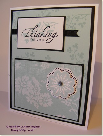
I belong to a Stampin'Up! demonstrators group, and we now have our own blog, NMBS Group. Our first challenge was to make a card using black, white, one color, a floral image and some bling. My first attempt was not quite what I was going after, so here is my second. This card is being sent to a friend of mine whose husband has a very aggressive kind of cancer. Since I am sure HE is getting lots of cards, thoughts & prayers, I thought it would be nice to send a card just to her. She is holding up her end by being a supportive wife and mom and I know she needs prayer too. So this is for Kim!
First, I used Sketch 49 by Tamara. I loved how the Afternoon Tea (another dose!) had the pretty bird & flower silhouette, so I put my embellishment to the right of it. The bling is on the embellishment: I used a black brad, stuck a mini glue dot on it and dipped it in glitter. I also used glitter on the flower itself. Here is a closeup: 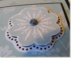
The embellishment is raised on dimensionals as well.
Stamps: Baroque Motifs, Fresh Cuts, Sincere Salutations
Paper: Basic Black, Whisper White, Soft Sky, Afternoon Tea DP
Ink: Stazon, Soft Sky
Acc: Brad, Black Grosgrain, DD Glitter, Glue Dot, Dimensionals
A cyber friend of mine, Dana, was remarking about layers on cards, and not liking to use so much card stock. I thought while I was making this card, I would show a little trick that I do when I have large layers. Some of you may already do this, but it never hurts to have a refresher! I apologize for the photo quality, I was taking them right at my work area and not really trying for good quality!
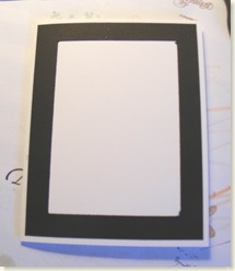
If you look at my card above, you see the base is white, then a black layer, then a Soft Sky layer. I cut my black layer 5 1/4" x 4".
Then I cut the center out, leaving a frame of about 1/2" all around. I do this with my SU cutter which allows me to lift the cutting blade and place it down "inside" the cardstock. Then the frame gets mounted on my card base.
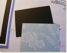 Then I trim the piece that has been cut out to use as a mat for the bottom focal piece.
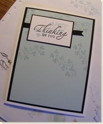 Then, I can mount the front panel over the black "frame" and continue creating my card.
This way, I have "lightened" my card and used the piece that would normally be covered up, as another layer. Hope this was helpful to someone!!!
Have a great day!
LeAnne

3 comments:
wonderful card, leanne !!!!i love the colors and the cute design.
tfs:)
chat
Duh... I've been looking, and inspecting that beautiful card and making notes and saving the photo....on and on and on.....and I FINALLY got around to READING your post!! Thank you for doing that for ME. You LIKE me!! You really LIKE me!!! lol and bless you.
Very pretty card!!! I love the soft colors you used....and those yummy papers!! Thanks for playing along this week!!
Post a Comment