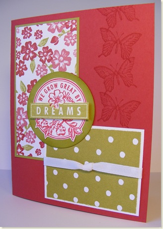
Ick! Who would want to be aged instantly?! Not okay for women, but great for DP that you want to look shabby in seconds. I had been looking at some cards that were "shabby chic" or "vintage" which is a look I love! And I was thinking how cool Bella Rose would look if it were aged or tea-dyed. So before I show you my sample and tell you how I did it, here is a card made for a special someone (she'll know when she gets it!) with SU's beautiful Bella Rose DP "straight" (unshabby) and Dreams duJour:
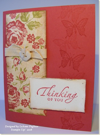
Pretty straightforward; the "DREAMS" is popped up with dimensionals. Now here is the one that I shabby'ed up:
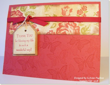
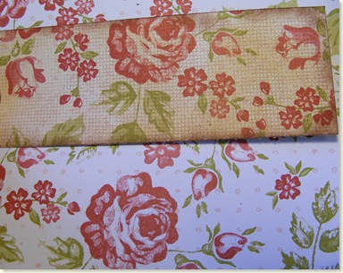
Instant aging!! This is a really easy technique and it is great to show at a workshop because it is like getting another piece of DP! Using More Mustard ink and a brayer, I simply brayered over the paper with the ink; if it looks a little splotchy or uneven, that's fine, it adds to the aged look. I find More Mustard looks more "golden" than Creamy Caramel. (I used a sponge brayer, but the hard rubber one in the SU catalog would work as well, I think.) I did use CC for stamping Canvas over top; that made it look more like fabric. Linen would have been PERFECT; however, since SU retired it, I can't use it in a workshop! Anyway, I sponged the edges with Close to Cocoa to finish the look. I also sponged the twill & button to tone down the color and distressed and sponged my sentiment panel. And remember, these are things I want to show at a workshop, so they are simple, uncomplicated cards. So there you have it--aging in an instant. Here's another:
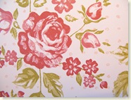
And just so you can see the actual difference in the before & after:
I'll bet you have some DP that you'd love to try this on!
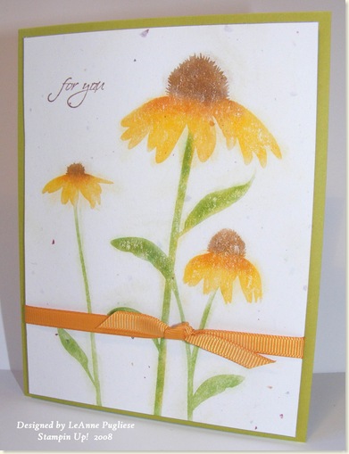
I also wanted to try stamping the floral image from Inspired by Nature using my Versamark & pastels, which is a neglected item on my stamp table! So here is my attempt:
This is an easy technique with a great "WOW" factor. I simply stamped on Confetti white with Versamark, then added my pastels, starting with the stems, then centers, then petals, using a cotton makeup applicator. It is easy to add shading with the pastels, and since I don't have Kiwi Kiss pastels to match my cardstock, I simply blended Yoyo Yellow & Garden Green on my applicator and applied it to the stems. There is no limit to your color palette when you have 48 colors of pastels!!! The small sentiment is stamped in Close to Cocoa and it is from All Holidays.
I hope you have a great weekend--it is beautiful here in SE PA and DH & I are going to take a little day trip--my surprise to him when he comes back home from his errands! Enjoy!
LeAnne


16 comments:
GREAT idea, LeAnne! That looks amazing with the aging.... very vintage! Makes me wish I still owned Canvas or Linen BG stamps!
Very pretty cards!!! I love that new Bella Rose DSP.
I wish I'd start using my supply of stamps and stop relying so much on computer elements. But I've found one thing to be very helpful: When I stamp and color, and I don't want to "stamp and color" again, I scan the original and print it as many times as I want onto cardstock. You can't tell the difference and there's less for me to do.
LeAnne thanks for sharing such a cool technique! Love it and your cards. Wow!
Lisa
What a fabulous idea! I love your "Poppin' Pastels" card too.
I like the shabby Bella Rosa DP idea..looks cool!
...and I hear ya, my pastels just sit there. One of those things I just HAD to have, but don't use. They look pretty on the shelf though, LOL!
I love how the canvas looks with this technique, really cool! Awesome cards, LeAnne!
I've been aging my cards for years.....just never wash your hands and you'll be surprised at the subtle change in the coloring on the cardstock!
Great technique, LeAnne! I'll have to print and file it for a future class! And I love the coneflower card! Beautiful!
ooo beautiful work leanne!! thanks for the great tips and techniques! its amazing how you can change the feel of a card by doing that - your cards (all of them are lovely!)
hope you had a wonderful road trip! its so much fun to do something impromtu like that!
Best wishes,
Sankari
beautiful card once again! Love the paper! Just wondering if you'd like to do a catalogue swap? Our catty comes out in Oct and I'd love to see what's in the new US one. Let me know if your intersted
I love this post! Thanks for all the tips---it makes me feel better to see all the different ways I can use what I have (since I have so much!!---thus, the feel better part!) Thanks for all the ideas in one post!
WOW! What awesome samples!! I tried that versa-mark chalk technique and I just can't get it to look good! Yours looks so awesome. I think my chalks are too dry. (Can that even be possible!! lol!)
The shabby cards are tooooo awesome!! I will definitely be remembering this - I need to order some more Bella Rose paper, I've been just flying through it!!
Wow, what a great technique thank you for sharing it with us. I can't wait to try it. I love the new Bella DP!! Your cards are so pretty!!
Your aged designer paper cards are gorgeous!
Love those cards! The aged paper looks fabulous! :-) And the pastels give such a nice look! :-)
Post a Comment