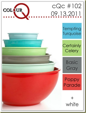
Happy Tuesday, peeps! The ColourQ challenge today is a bright cheery one---don’t you wish you had some fun bowls in your kitchen like this? Everything would taste good whipped up in these! I think I am still using mine from the 1970s—yikes! Retro, for sure!
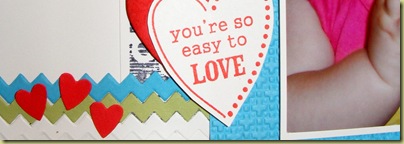
Nothing was coming to mind for a card, so I thought I’d make a scrapbook page. 12x12 pages are daunting to me, and 6x6 wasn’t big enough for the photo I wanted to scrap, so I rummaged through my yardsale finds and came up with an 8x10 frame; although it wasn’t white, I think it still worked for my project:
It’s tough to capture something as large as a frame in a little blog space, but I hope you can see the details. All the color blocks have been embossed with various EFs. I used a couple new (to me) stamps for the sentiment and interest image:
and then added some “rickrack” from the Tasteful Trim die. A really easy quick 3D project that will look cute on my dry sink. Email me if you have any questions--and by the way, the baby shoes are DH’s!!! I hope you will scoot over to the CQC blog and share your project with us---you may be crowned the Queen!


You're just the best, if I could not think of soemthing for a card, I sure would not have been able to come up with an idea for a picture frame!! Love the EF's and the stamps are PERFECT. Everything makes little Cassidy's eyes just beam!!!
ReplyDeleteDarling project. Just love the photo of Cassidy. TFS
ReplyDeleteCute, cute, cute.
ReplyDeleteAbsolutely adorable, LeAnne! I just love how your frame came out and of course, Cassidy steals the show with those beautiful blue eyes! Thanks for the inspiration to try to make one of these frames, too! Looks great! :)
ReplyDeleteWhat a great idea framing the page. Cassidy is so adorable and your layout is terrific.
ReplyDeleteADORABLE!!!
ReplyDeleteOh, LeAnne! This is just adorable! Your projects are always so creative! Love it!
ReplyDeleteSuch fun blocks! PERFECT MODEL, of course. ;)
ReplyDeleteSo adorable, wow, what a great project. I need to do this for my daughter, her room is a little bare...he he he. Great layout and use of the colors.
ReplyDelete